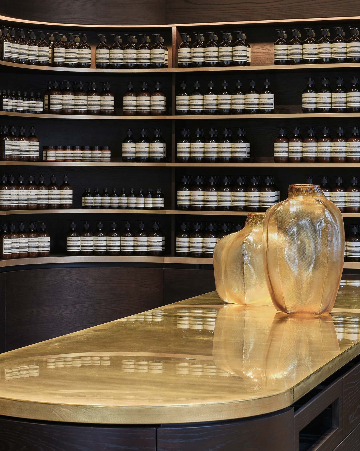
Aesop Wellington, situated within the historic Change House, was designed in partnership with Auckland-based designer Rufus Knight. Our first signature store in the city, its interior draws on a warm palette of natural timber and brass, offering a subtle contrast to the building’s commanding façade. To mark the store’s opening, it was with great pleasure that we spoke with Rufus about the influences and inspirations behind the space. What were some of the chief inspirations behind the design for Aesop Wellington? The design of Aesop Wellington took cues from the site’s proximity to the nearby Lambton Harbour, adjoining harbour sheds and their strong association to trade; industrious maritime heritage; and turn-of-the-century European design influence. Change House at 150 Featherston Street is a 1930s office building designed in an inter-war transitional style whose façade incorporates elements of the Art Deco, the Chicago School, and the New York Skyscraper styles. The building has townscape value for the visual interest it adds to Featherston Street. How did you translate these references in the context of retail architecture? Formally, the interior aimed to reflect on this collage of European influence and reference the fluid yet tactile forms of the Modernist period within which Change House was built. We wanted to establish a robust but sensitive practicality; a measured balance between the industrial and the domestic. The curving shapes of the space—the rounded brass-edged shelves that follow the form of the central display wall—are offset by the linear product display, and by dark timber.
An interview with designer Rufus Knight
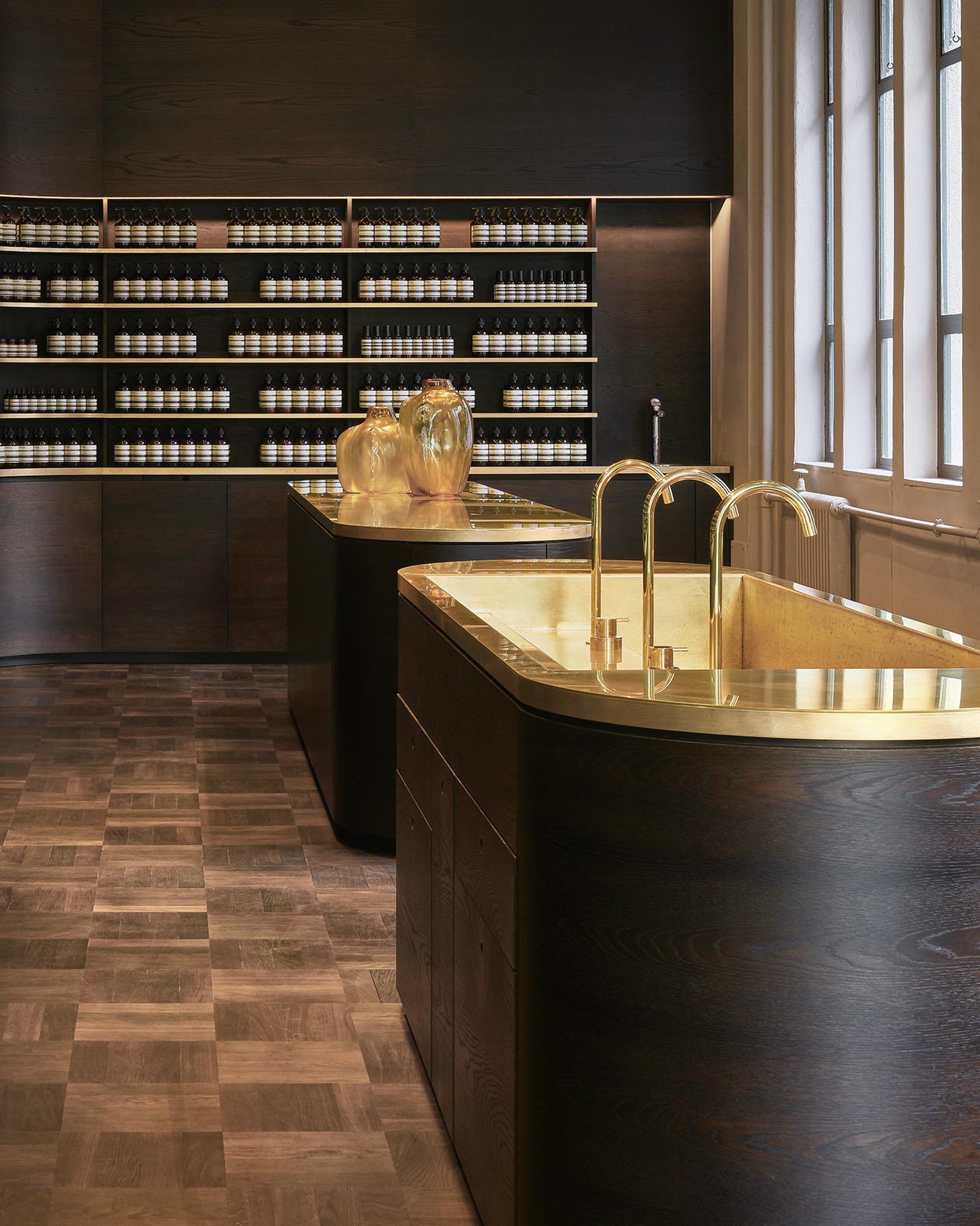
Can you speak about the some of the store’s key features and its materiality? The materiality of the store aims to reflect the inherited history of law and commerce practised at Change House. Basket-weave parquetry, oiled timbers, polished brass and specialist plaster finishes propose a layered sense of history in concert with a contemporary retail experience. Importantly, the exterior portico has been restored to complement the original Granite plinth and decorative brick masonry to both the Featherston and Brandon Street facades. The reinforced concrete structure of the interior has been retained and expressed to emphasise the generous ceiling height and encourage available natural light, creating a clean, warm atmosphere. The store’s centrepiece is a large demonstration sink fitted with polished brass tapware. The interior display wall references the skilful positioning of the building on its corner site, but introduces a Modernist spirit through the interplay of a large unbroken gesture where function is recessed, and form remains absolute. Conversely, a classicist material simplicity contributes to a feeling of nostalgia as if the retail display has occupied one of the building’s original bureaus. What will Aesop Wellington introduce to the local area and neighbourhood around Change House? I think that Aesop Wellington’s position on this corner site will add a strong sense of address, activating both Featherston and Brandon Streets, and highlight the buildings unique design and historic qualities. I also hope the rich materiality, restored façade and expanded glazing will act as a sort of beacon within the busy commercial end of the Lambton Quarter.
Rufus Knight was born in Opotiki, New Zealand. At Victoria University's School of Architecture and Design in Wellington, he undertook studies in Interior Architecture after which he held an Associate position at award-winning practice Fearon Hay Architects. Following working terms abroad in Europe, notably for Vincent Van Duysen Architects in Antwerp, he opened his own Auckland-based studio, Knight Associates, concentrating on Interior Architecture and Design in 2016. Working on a global portfolio of projects, Knight Associates apply an honest and tactile aesthetic to residential, commercial, and experiential briefs from a cultural and contextually informed approach. Knight Associates' work has been published internationally and in 2015 the studio was awarded the Designers Institute of New Zealand's highest achievement for Spatial Design, the Purple Pin, for their work on the Lonely Ponsonby flagship. More recently they have curated part of the New Zealand national pavilion at the 2016 Venice Architecture Biennale.
